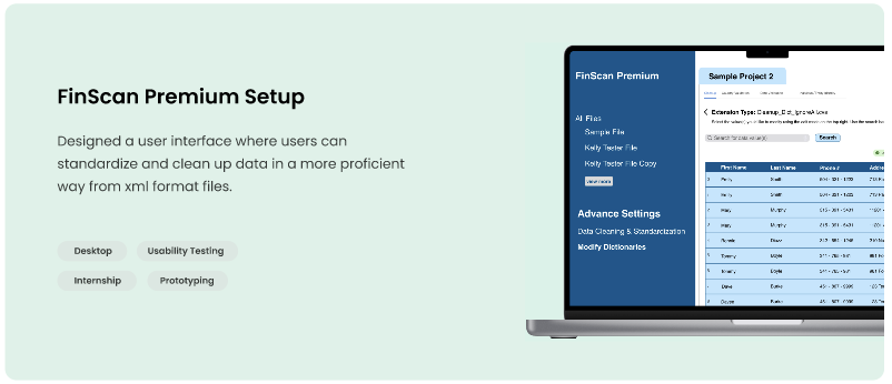
FinScan Premium Setup enhances the user's experience by turning the script file into a user interface which users can better interact with.
FinScan Premium Setup enhances the user's experience by turning the script file into a user interface which users can better interact with.
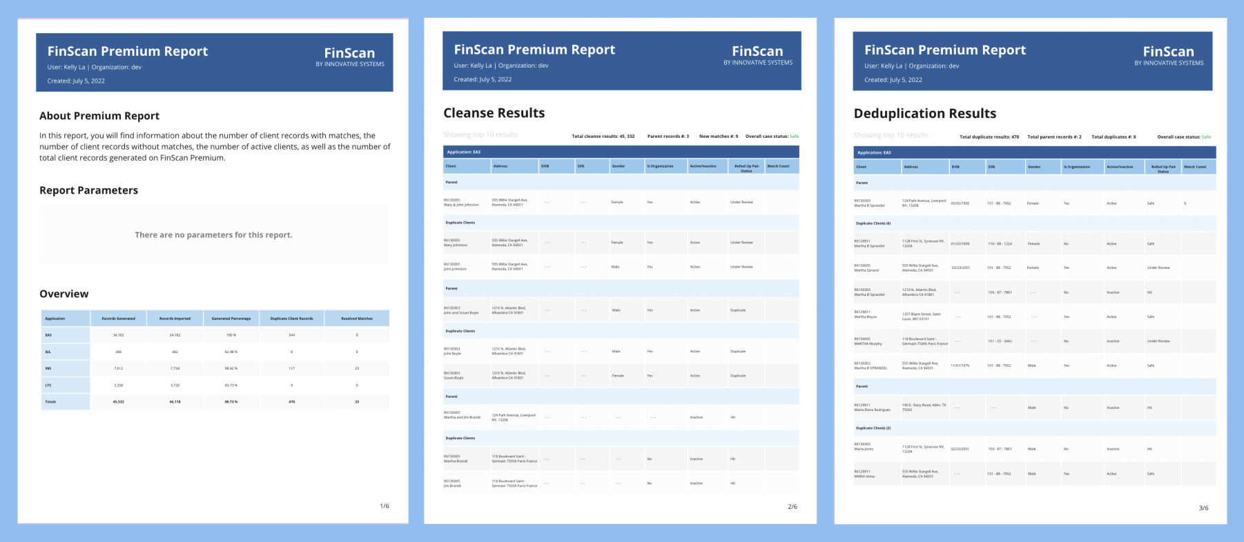
Premium Reports serve as an indispensable tool for Professional Services, facilitating meticulous data analysis. This platform offers two pivotal features: firstly, it empowers clients with insights into instances where their records undergo segmentation, ensuring transparency in the process; secondly, it adeptly identifies pairs of records tagged as duplicates, enhancing data integrity. Despite the evident value proposition, the current adoption of Premium Reports remains somewhat limited within the client base.
User Research
Interaction
Visual Design
Usability Testing
Prototyping
May 2022 - August 2022
Jim Brensteinner (UX Manager)
Founded in 1968, Innovative Systems is a pioneering technology company renowned for its groundbreaking solutions in data quality. With an unwavering focus on innovation, the company has consistently delivered cutting-edge products and services that address complex challenges faced by businesses. Their commitment to staying ahead of the technological curve is evident in their portfolio of empowering, protecting, and scaling compliance solutions. Backed by a team of experts, Innovative Systems embodies a culture of excellence, providing clients with the tools they need to thrive in today's dynamic digital landscape. Upon joining Innovative Systems, I was hired as the UX/UI design intern. In my capacity as the UX Intern, my principal objective revolves around delving into the intricacies of Premium reports. Through this exploration, my aim is to comprehensively discern the prevailing issues and challenges while concurrently enhancing the user interface. By doing so, I endeavor to elevate the product's utility and value proposition for our esteemed clients. Reflecting on the past year, I take pride in the notable strides I've taken. Some of the key accomplishments include:
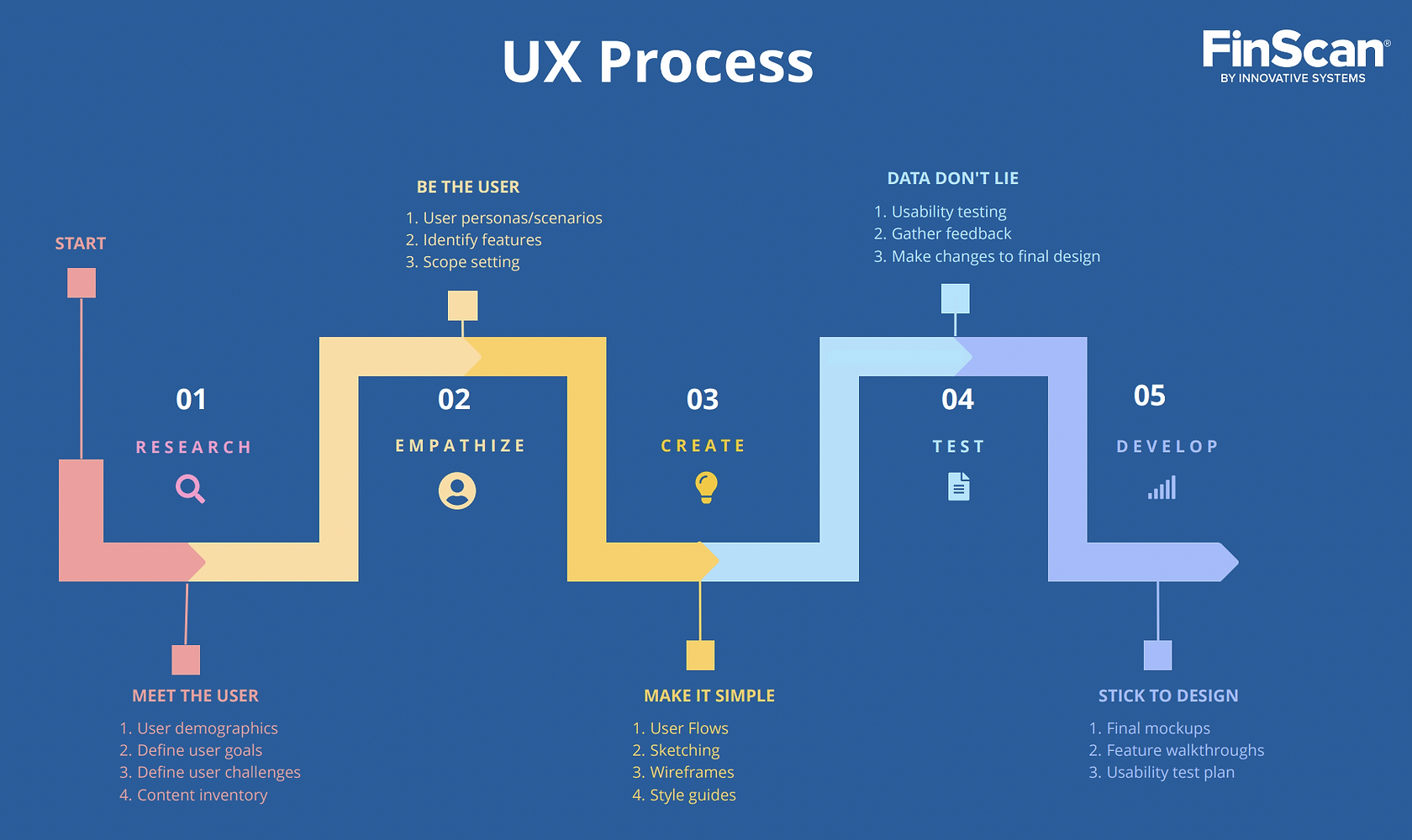
Our process on FinScan Premium Reports is based on on a crafted UX Process timeline that is similar to the Lean UX Process. We aim to incorporate the key phases of Research, Empathize, Ideate, Test, and Develop.
Breaking it down, we are focusing on designing a user friendly interface to make records less overwhelming to scan through, offer key features that clients find valuable and allowing users to navigate to what they're searching for in a timely manner.
Before joining Innovative Systems, there were mockups created for the Reports page but no usability test were conducted which was ineffective in determining whether the users experiences were improved or not. I conducted research interviews with primary clients and account managers to uncover pain points that they were experiencing with the existing reports.
In the scope of my user research, I followed these criterion:
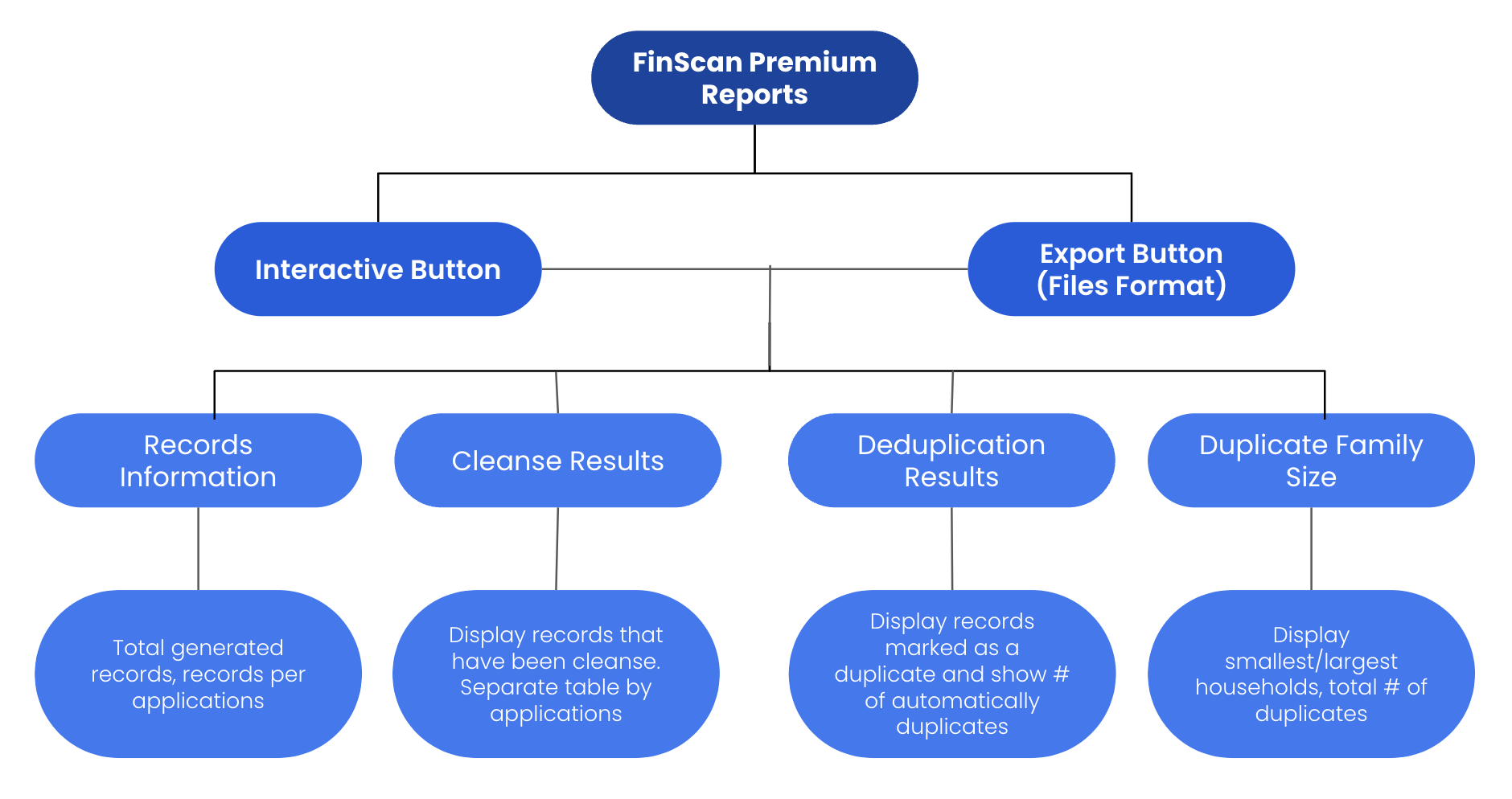
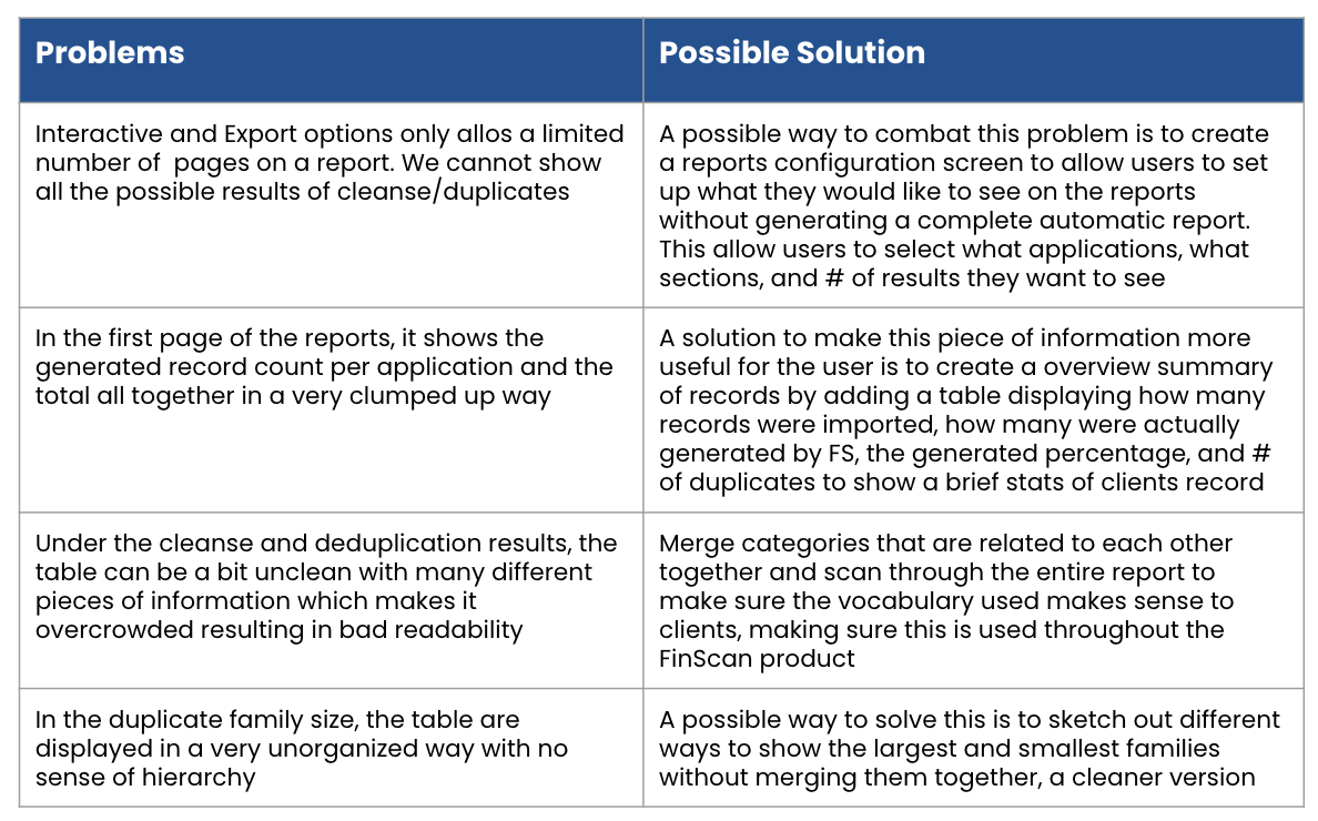
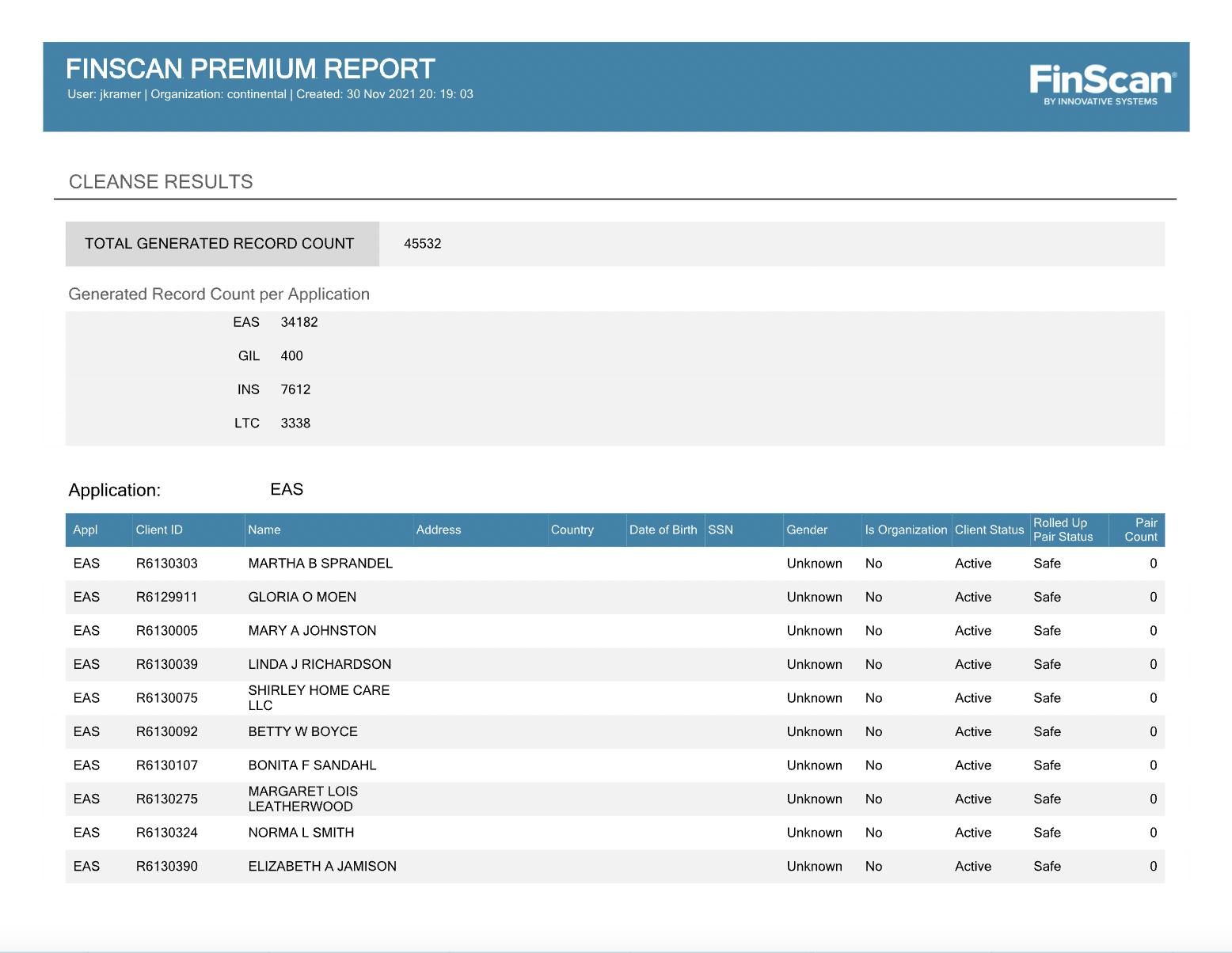
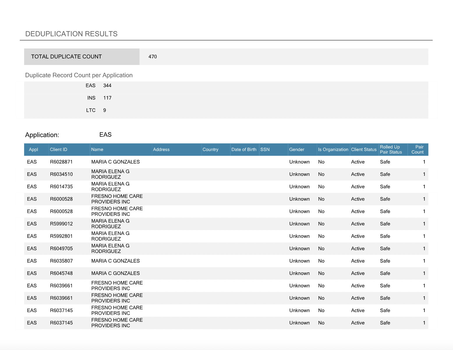
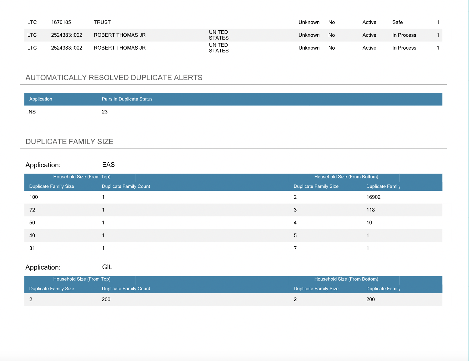
The main issue with Premium Reports is their lack of valuable information for users. Users find the report layout cramped and some sections misleading. Notably, under cleanse and deduplication results, original records before segmentation aren't shown, and parent records of duplicates aren't identified. This missing context diminishes the value and utility of Premium Reports, failing to meet user goals effectively. Addressing these gaps through improved content presentation and contextual information will enhance the report's value and user experience.

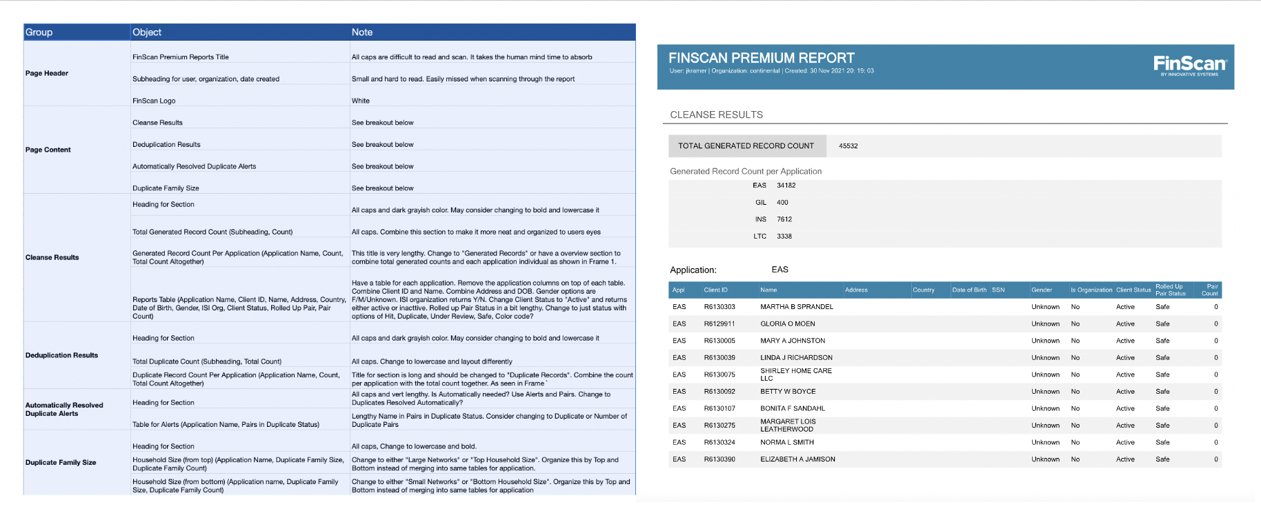
Content inventory is a result of cataloging a product's whole content in an easy-to-access manner. Creating this table allows us to better understand what types of pages and content are being created and how it is organized. This is a great method to determine the quality of content on Premium Reports and whether it needs to be updated or removed.
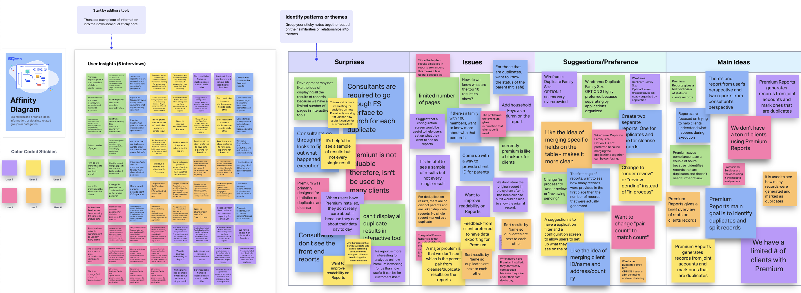
After conducting user interviews with clients, I proceeded to engage in the process of affinity mapping alongside my colleague. This endeavor was aimed at the amalgamation of the identified pain points, wherein we meticulously categorized these challenges based on common themes and pertinent features within the product.
I embraced a methodology firmly rooted in data-driven insights, specifically harnessing the potency of the severity framework, to not only inform my procedural course but also to categorize usability concerns in an order of importance. This framework plays a pivotal role in discerning the degree of severity associated with each usability challenge, a computation contingent on the amalgamation of three variables:
Severity = Task Criticality (TC) × Impact (I) × Frequency (F)
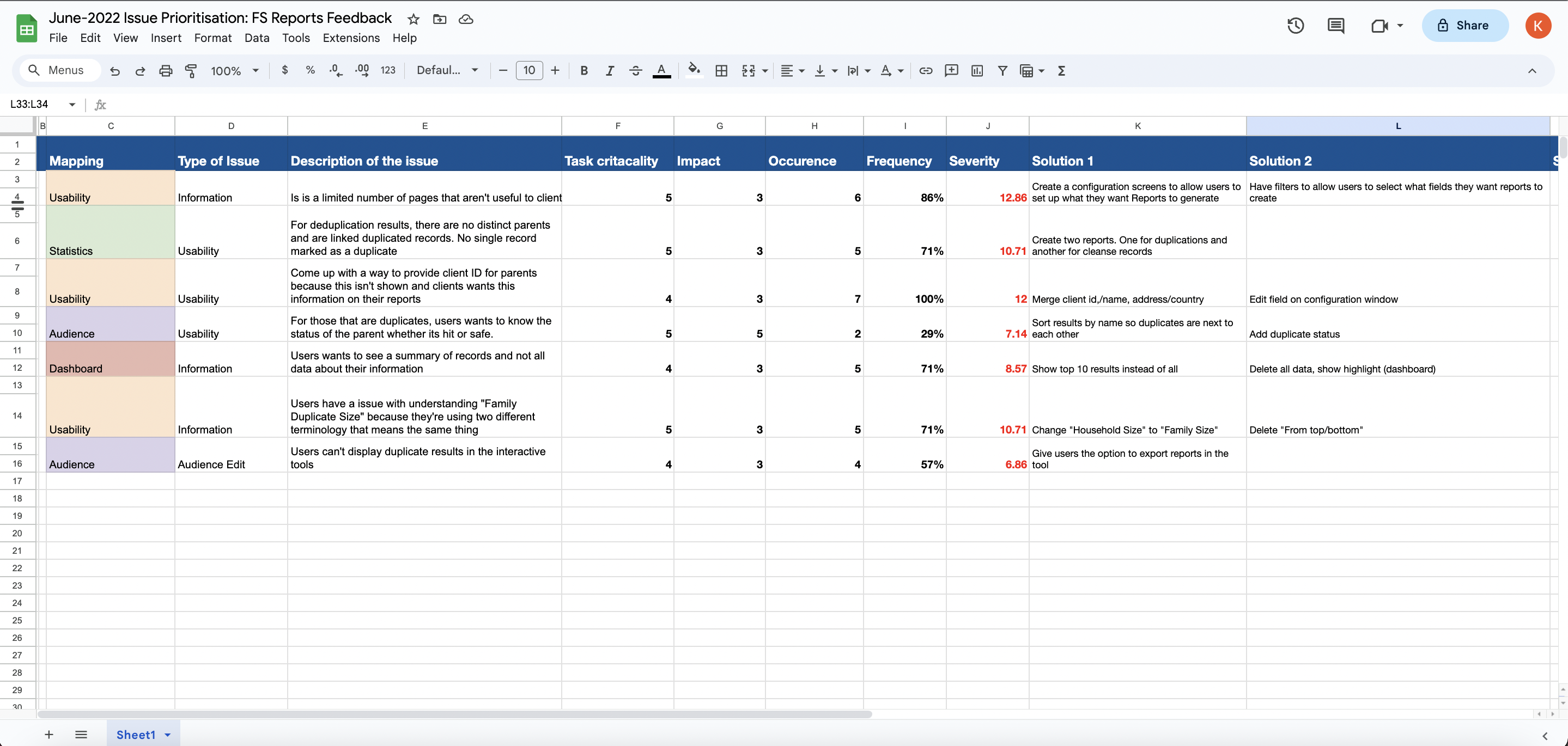
Based on the user interviews conducted with 6 user on the existing Premium Reports, we found the following key issues:
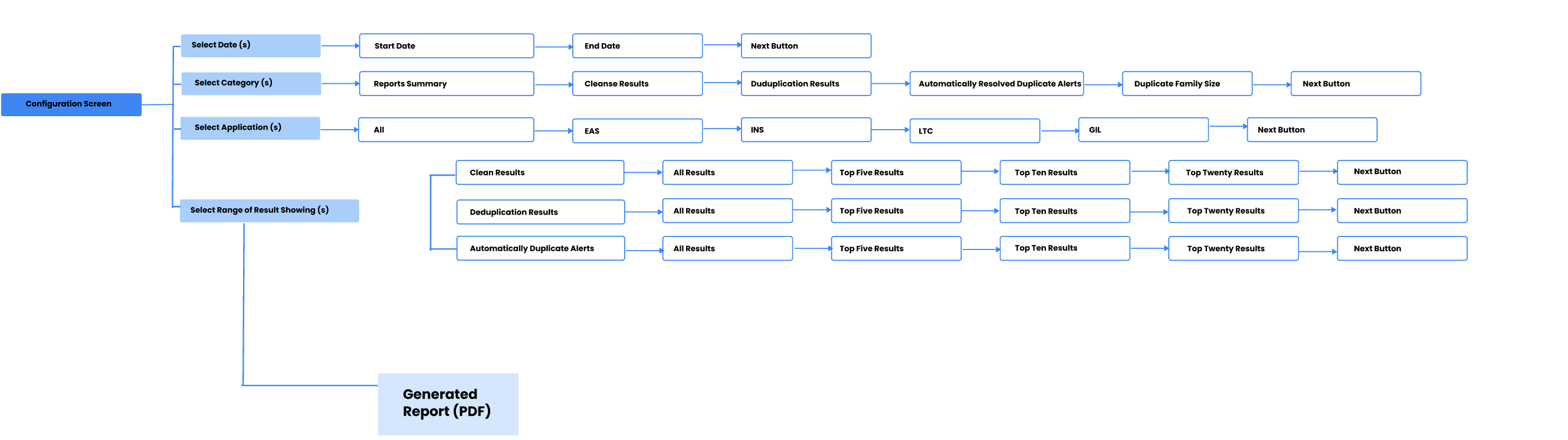
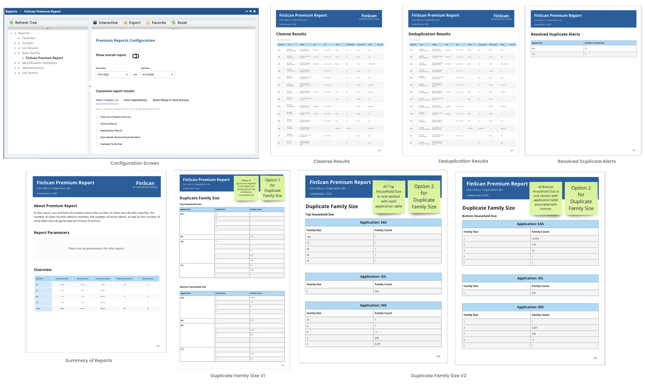
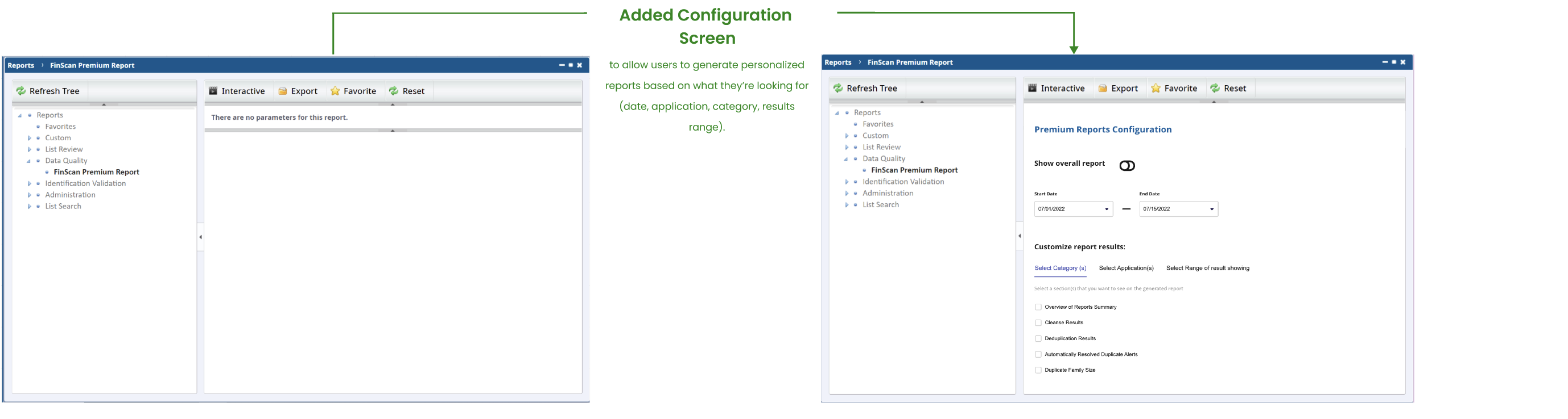
Drawing from the insights through affinity diagramming and a comprehensive evaluation of the current product, our collaborative team effort culminated in the delineation of the main features users found valuable. These encompass the processes of configuration before the report gets generated. This is a new feature that will be added enabling our users to customize what kind of information they want to see on their reports instead of getting it generated by default.
This dynamic entry point serves the dual purpose of not only introducing the platform but also enticing new users to explore its offerings. I have developed an information architecture that underpins the site's structure and functionality.
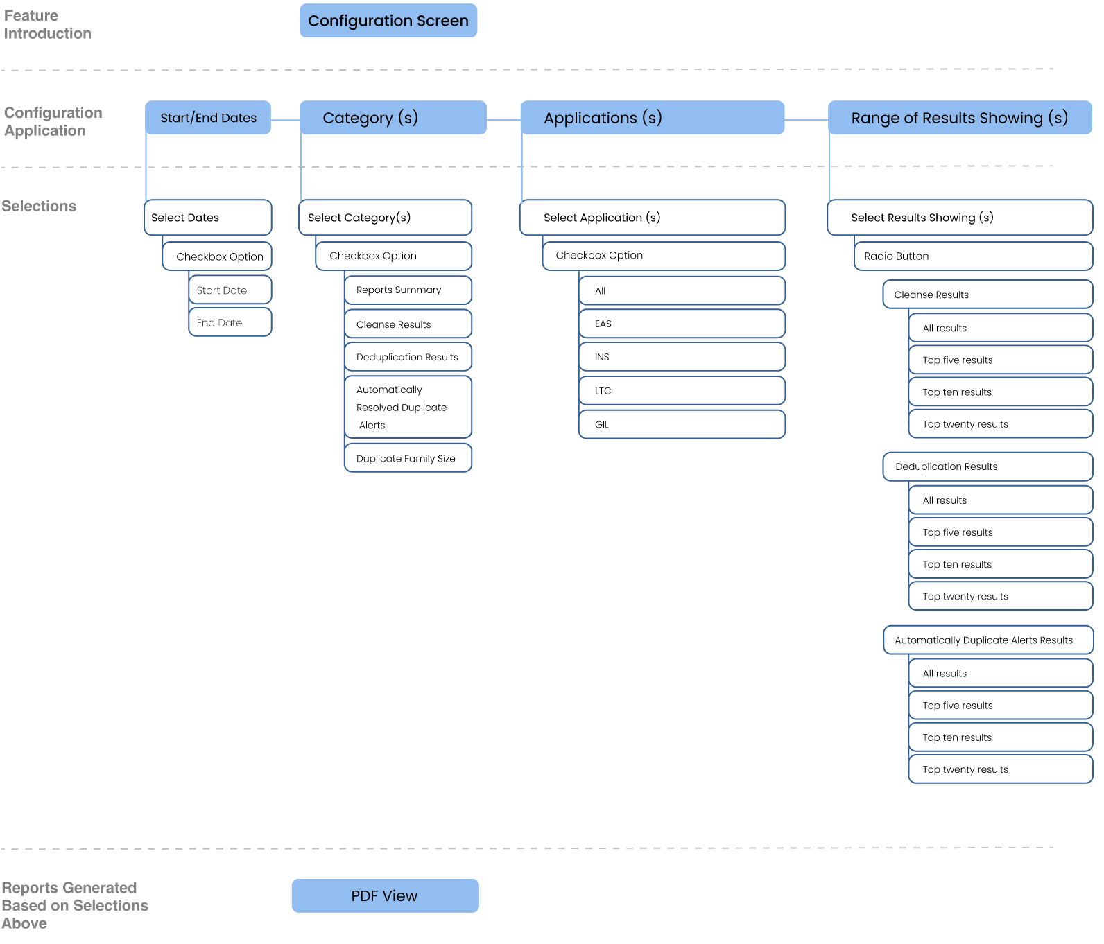
In order to refine the delineation of user interactions, we crafted distinct user flows for various features, thereby enhancing our understanding of users' anticipated utilization patterns.
In response to the problems identified through user research, we attempted to alleviate these user concerns by formulating potential solutions:
I mocked up low fidelity wireframes to gather feedback from stakeholders encompassing Product, Engineering, and users on the holistic arrangement and layout of the Reports page. This includes developing a uniform visual hierarchy and layout paradigm for the Reports component.
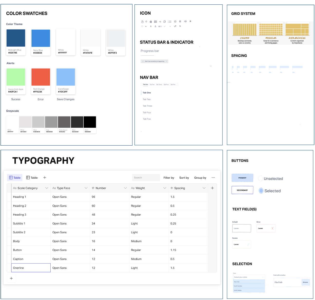
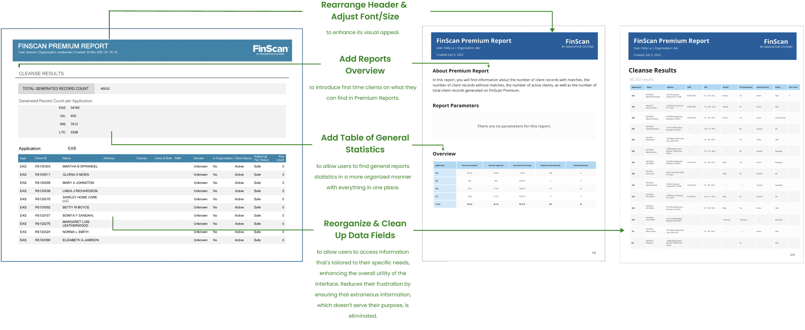
In response to user feedback, we established a design system aimed at efficiently handling design on a larger scope. This system not only fosters a unified language and visual coherence across diverse channels but also integrates fonts, colors, and icons aligned with our company's branding, thereby resonating with our users' familiarity.
The original FinScan Premium Reports gave most of the information that clients needed about their cleansed data. However, it had many user experience issues:
After going over all the issues with my clients, I started mocking up design solutions for each Reports page. Below is a comparison between the original product detailed page and the redesigned one.

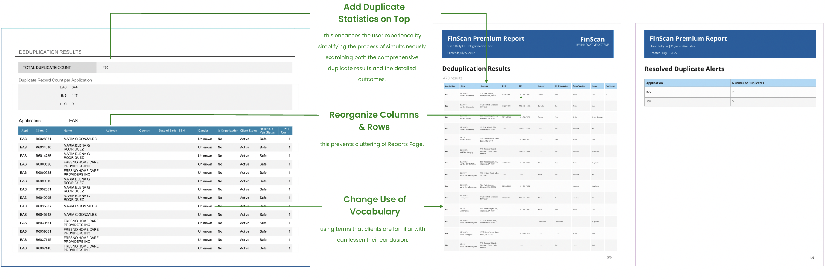
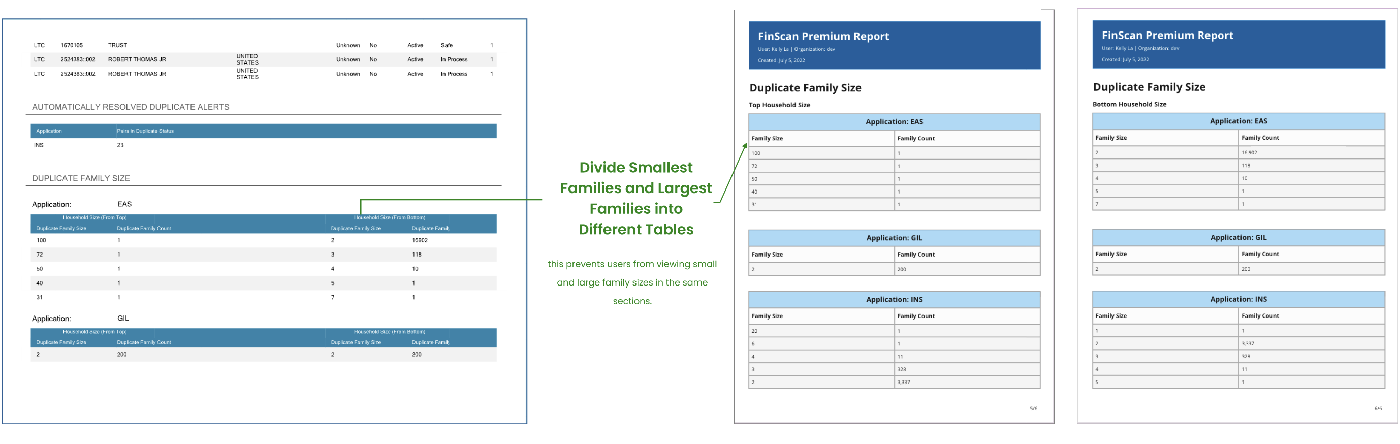
After conducting usability testing, we took proactive steps to enhance the design in alignment with user feedback. A prominent adjustment involved the incorporation of FinScan's distinct brand colors into our color palette. Moreover, we reorganized certain categories within the "Duplication Results Status" section to emphasize the hierarchy and improve user understanding. Additionally, we fine-tuned terminology within the "Duplicate Family Size" to better align with user preferences.
Since the implementation of the new redesign of Premium Reports, there is a decrease in the number of complaints. Additionally, users are happy about the configuration screen, praising on how useful it is when looking for specific applications and type of cleanse/duplicate results. Clients spoke highly about how organized the data fields are and how it saves them a large proportion of their time.
Some key takeaways from this project are: