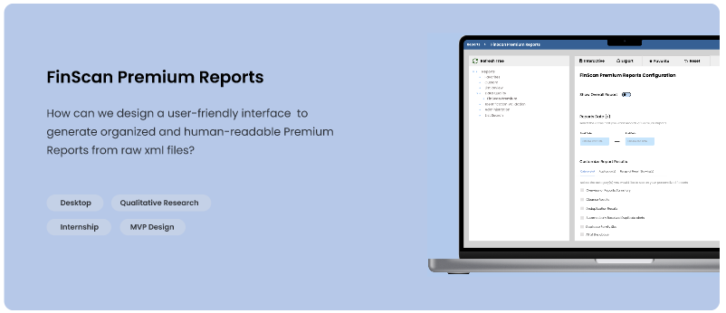
FinScan Premium Setup enhances the user's experience by turning the script file into a user interface which users can better interact with.
FinScan Premium Setup enhances the user's experience by turning the script file into a user interface which users can better interact with.
Finscan Premium is a AML screening platform with a built in data quality engine and transparent matching algorithms. It is used to screen individuals and organizations to intelligently evaluate information across the entire record and catch every real hit. As a UX and PM intern, our main goal is to enhance the user's experience by turning the script files to a user interface where users can better interact with the product.
User Research
UX Design
Prototyping
Usability Testing
Interface Design
May 2022 - August 2022
Glenn Stein (Software Engineer)
Robin Maillard (PM Intern)
Founded in 1968, Innovative Systems is a pioneering technology company renowned for its groundbreaking solutions in data quality. With an unwavering focus on innovation, the company has consistently delivered cutting-edge products and services that address complex challenges faced by businesses. Their commitment to staying ahead of the technological curve is evident in their portfolio of empowering, protecting, and scaling compliance solutions. Backed by a team of experts, Innovative Systems embodies a culture of excellence, providing clients with the tools they need to thrive in today's dynamic digital landscape.
I was the sole UX/UI designer of the team.
Upon joining Innovative Systems, I was hired as the UX/UI design intern in a dynamic company comprising 200 engineers and 7 product designers. As a pivotal member of the UX team, my central mission revolves around navigating the intricacies of Premium SetUp Screen. This involves a proactive effort to enhance user experiences by converting intricate script files into an intuitive user interface, fostering enhanced interactions with our product. Reflecting on the past year, I take pride in the notable strides I've taken. Some of the prominent milestones include:
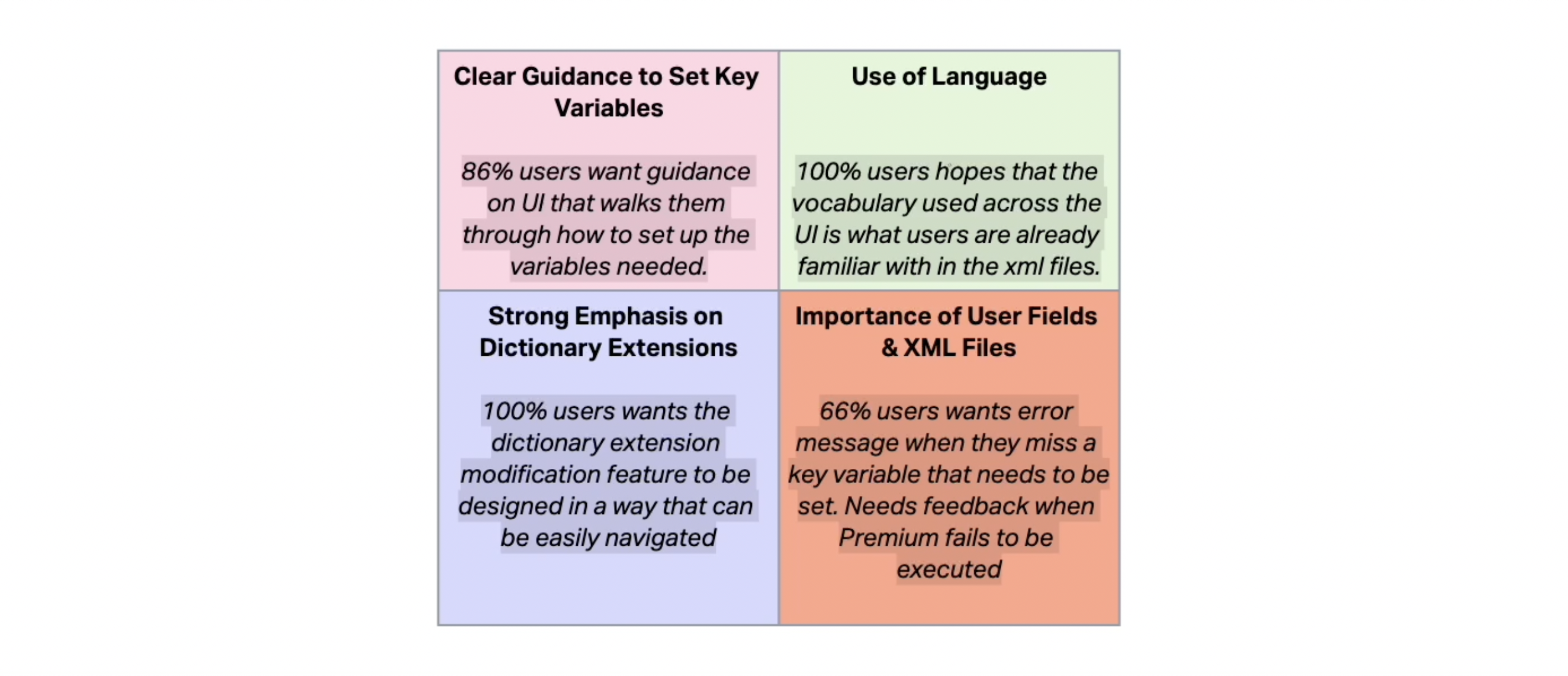
FinScan Premium streamlines data entry using Grammar Parse and Dictionary Extensions. It ensures accurate and standardized information by understanding context and meaning. However, it faces some difficulties that prevent users from having a pleasant experience.
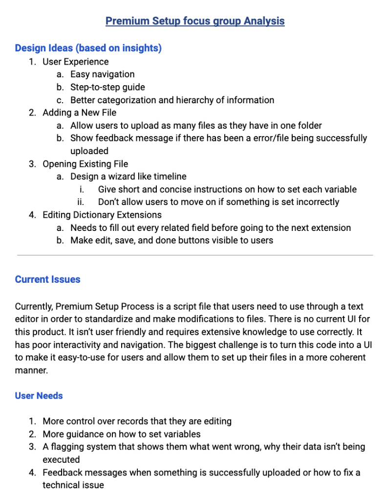
No centralized platform to track edits during consecutive XML file iterations
This is problematic because users lack visibility into the editing process. Additionally, dealing with numerous script files complicates interaction and recollection of which files require edits.
Inconveniences in modifying and standardizing variables to xml files
These files are scattered across different locations in the directory, making it challenging for users to efficiently locate what they need.
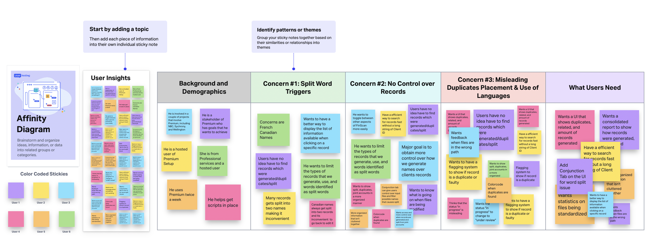
Based on the 1:1 interviews with 6 people worked at Innovative Systems, we basically divided they into 2 groups: ISI Clients and ISI Prototype Engineers, as these 2 types of people behave differently and also have different goals.
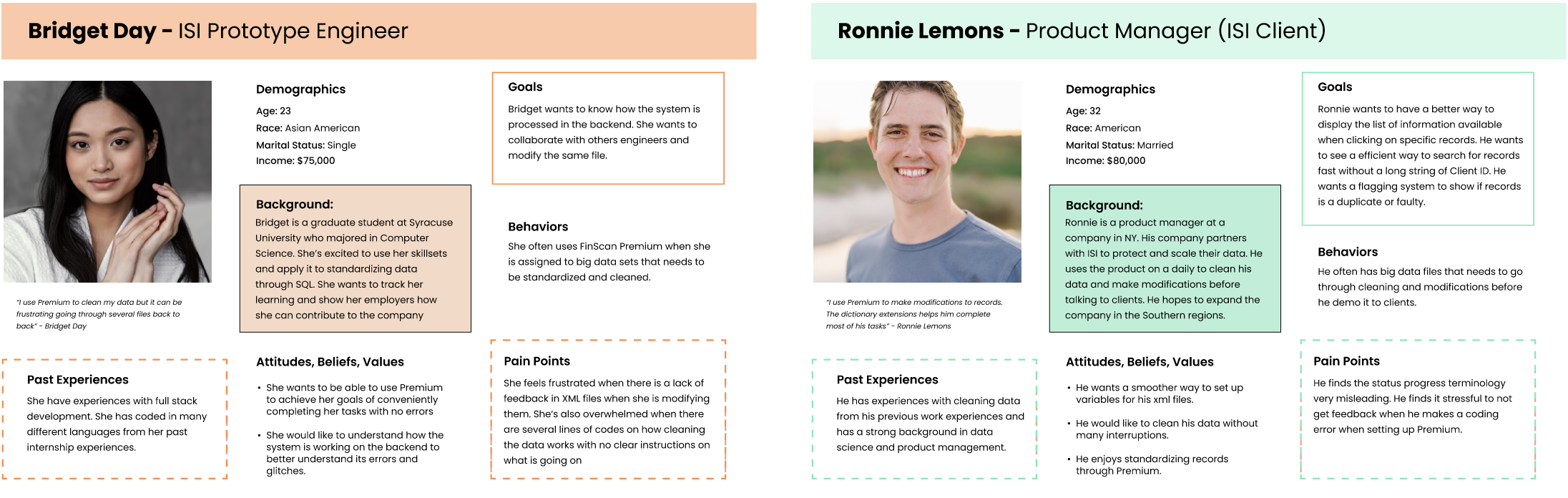
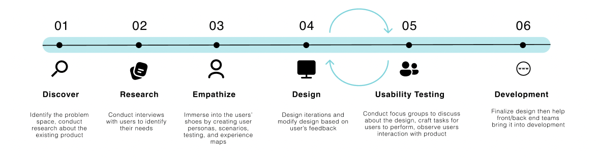
We conducted contextual interviews with 6 users to better understand the issues with the existing product and their needs. We took the user insights and created the affinity diagram and clustering their concerns in specific themes.
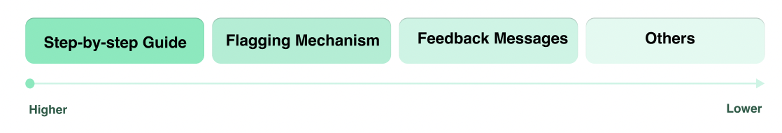
We used a Action Priority Matrix to identify the concerns that our users have in common by dividing it into low/high effort organization and value to the user. This allowed us as a team better understand what users need and design a system that work for them efficiently.
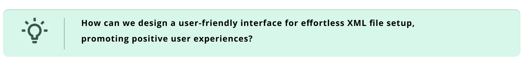
Drawing inspiration from user feedback, we established fundamental design objectives. The overarching aim entails crafting an immersive, streamlined, and user-friendly process for standardizing records.
- Introduction of a landing page that distinctly outlines objectives and provides intuitive guidance.
- Implementation of a responsive web user interface that seamlessly adapts to various devices.
- Enhancement of menu tabs for improved clarity and user-friendliness.
- Integrate a feedback messaging system that adeptly alerts users to the presence of errors.
- Implement affirmative feedback mechanisms for successful uploads, reinforcing user confidence.
- Facilitate users in tracking the status of their records, enabling timely awareness of execution progress.
- Alleviates user frustrations, catering to those unfamiliar with the system.
- Facilitates seamless configuration of essential variables, minimizing the occurrence of errors.
- Offers precise, unambiguous instructions to facilitate the successful execution of record processing.
Informed by our comprehensive interviews and meticulous analysis, we have gained a profound comprehension of the varying degrees of importance attributed to different features. This invaluable insight forms the bedrock upon which we construct our information architecture. Given that knowledge sharing emerges as the utmost priority, we have judiciously elected to prominently showcase this pivotal functionality on the homepage.
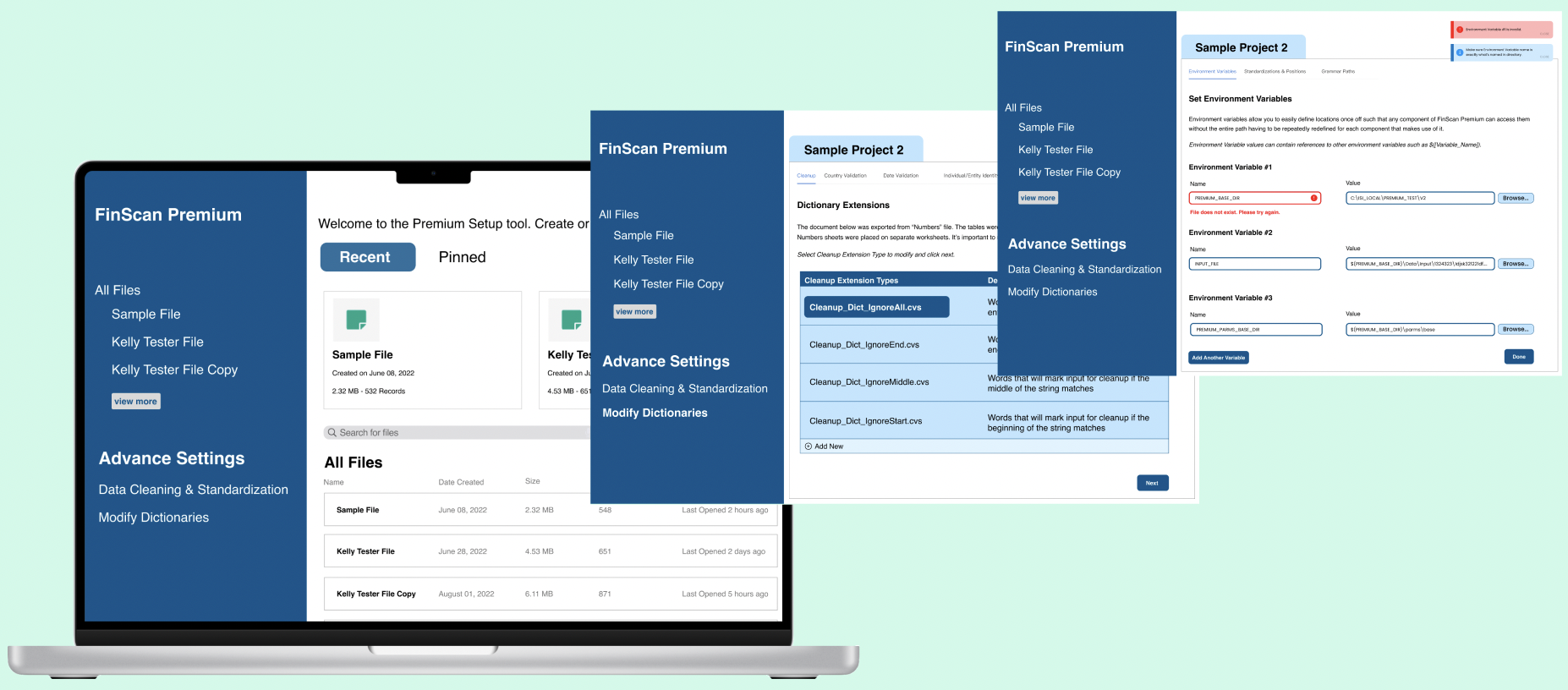
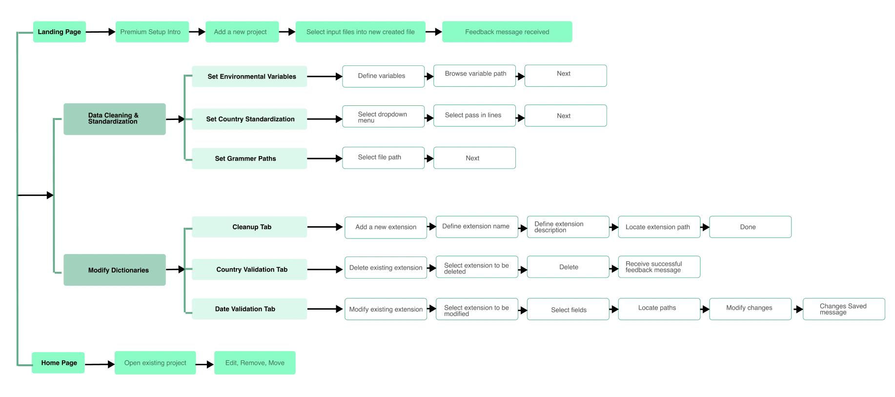
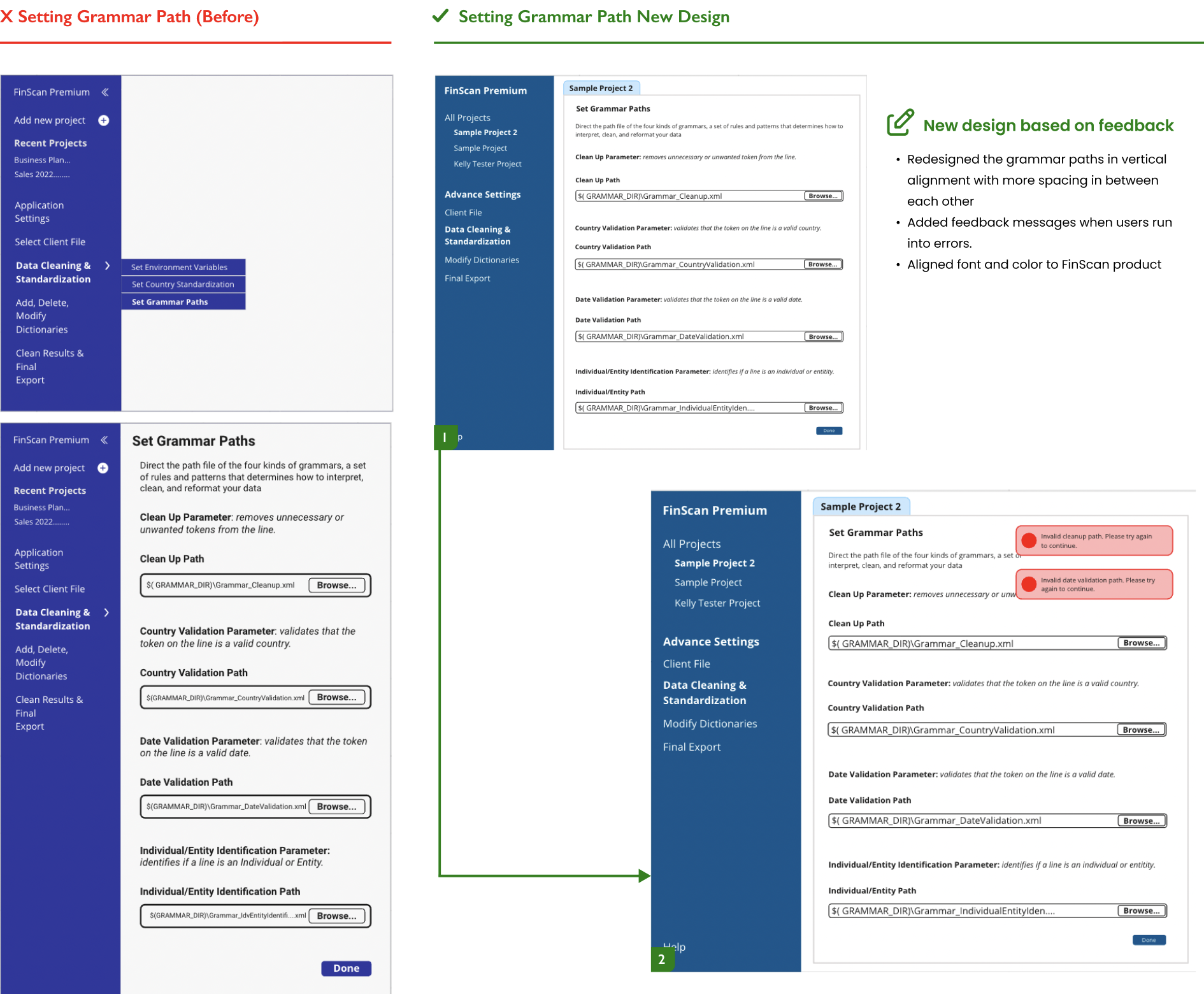
Drawing from the insights through affinity diagramming and a comprehensive evaluation of the current product, our collaborative team effort culminated in the delineation of three pivotal features. These encompass the processes of File Uploading or Accessing Existing Files, Configuration of Environmental Variables and the Streamlining of Grammar Paths & Country Standardization, as well as the Modification of Dictionaries to facilitate a premium user setup.
Furthermore, our strategic design approach extends to the incorporation of a captivating landing page. This dynamic entry point serves the dual purpose of not only introducing the platform but also enticing new users to explore its offerings. I have developed an information architecture that underpins the site's structure and functionality.
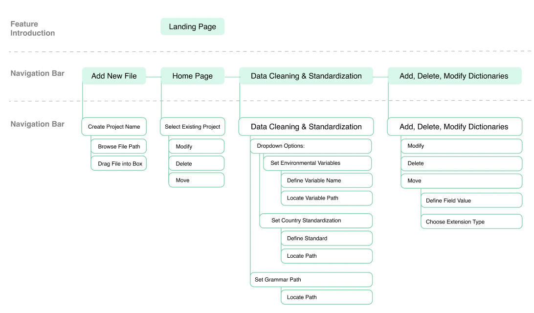
In order to refine the delineation of user interactions, we crafted distinct user flows for various features, thereby enhancing our understanding of users' anticipated utilization patterns.
During this phase, we used wireframes to engage in conversations with our stakeholders, gaining deeper insights into their user requirements. The majority of our pages were designed in alignment with the established information architecture.
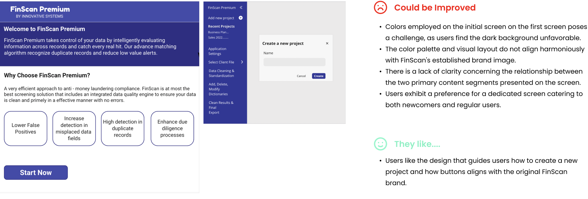
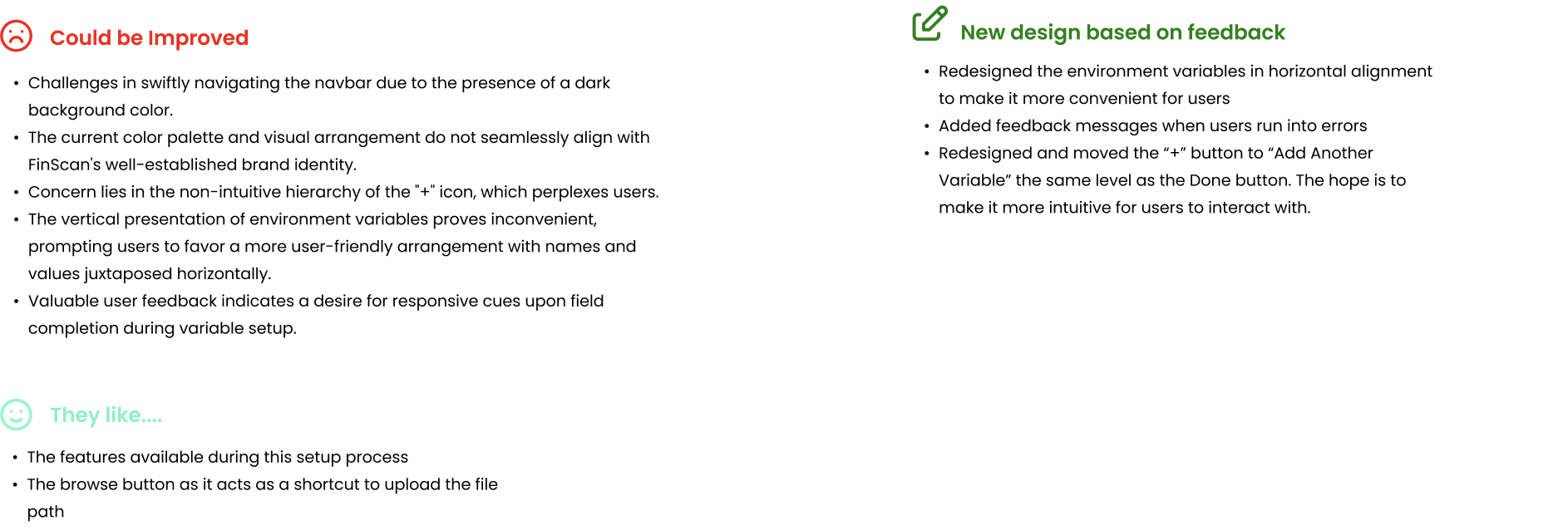
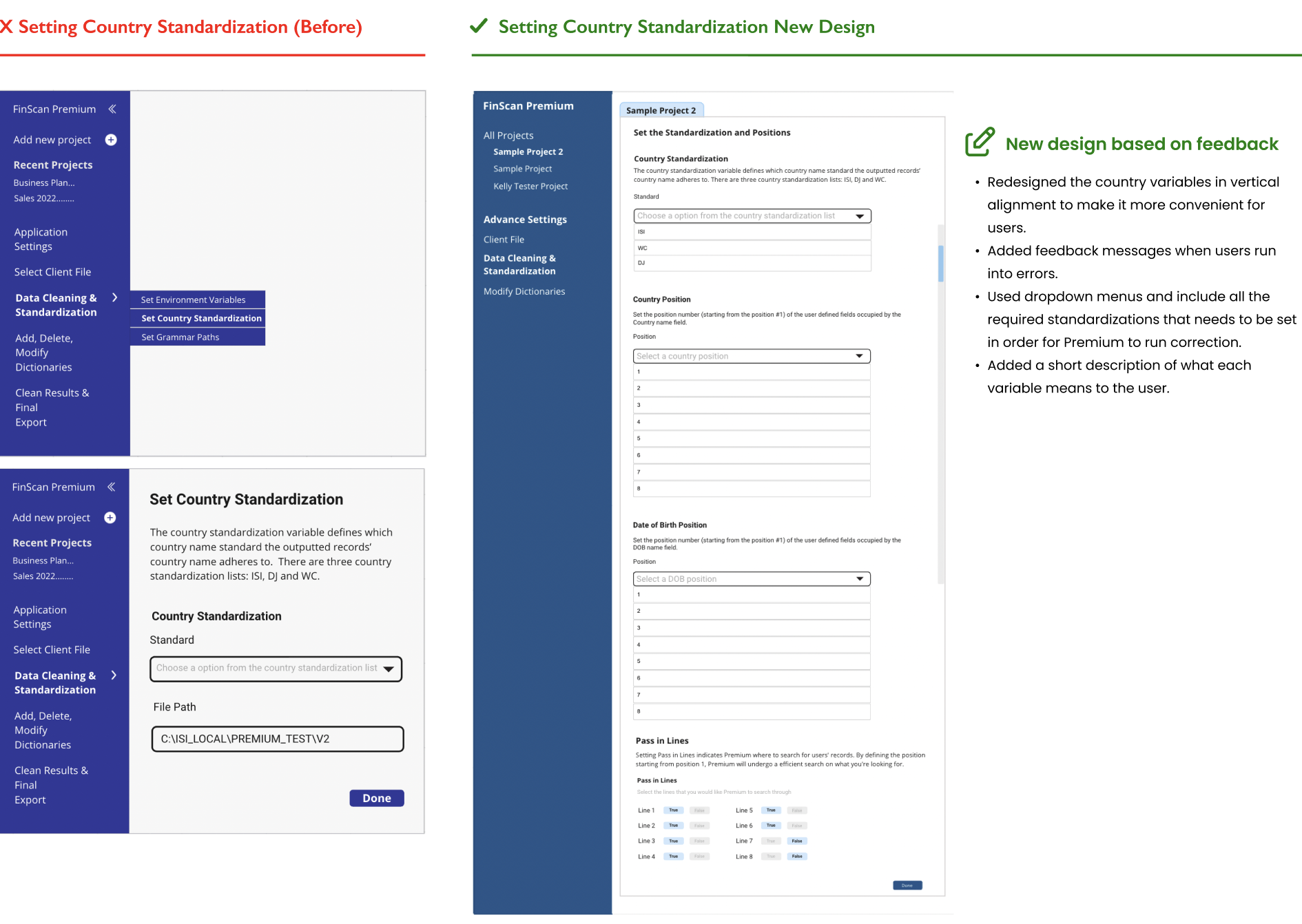
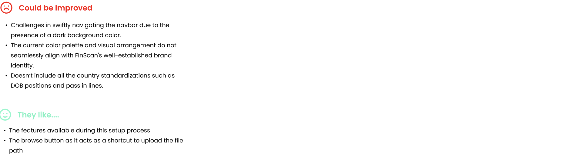
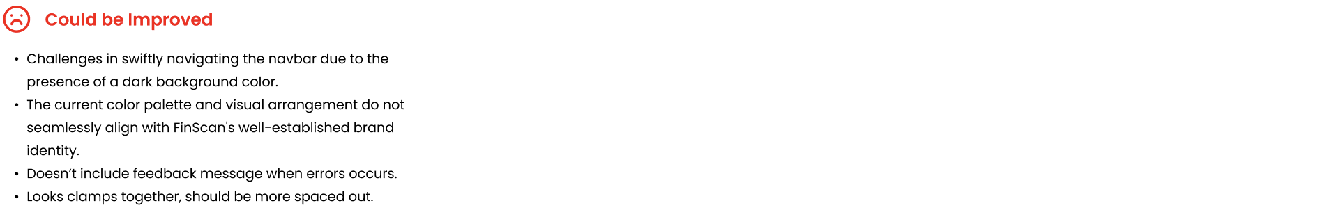
During this phase, our engagement with stakeholders led us to address certain challenges. A significant portion of the participants in the focus group lacked familiarity with wireframes, prompting a preference for visual components infused with FinScan's branding colors. Additionally, valuable insights were shared, including suggestions to eliminate redundancies and optimize feedback messages, ensuring they seamlessly coexist alongside user activities rather than causing interruptions. We progressed to crafting high-fidelity prototypes.
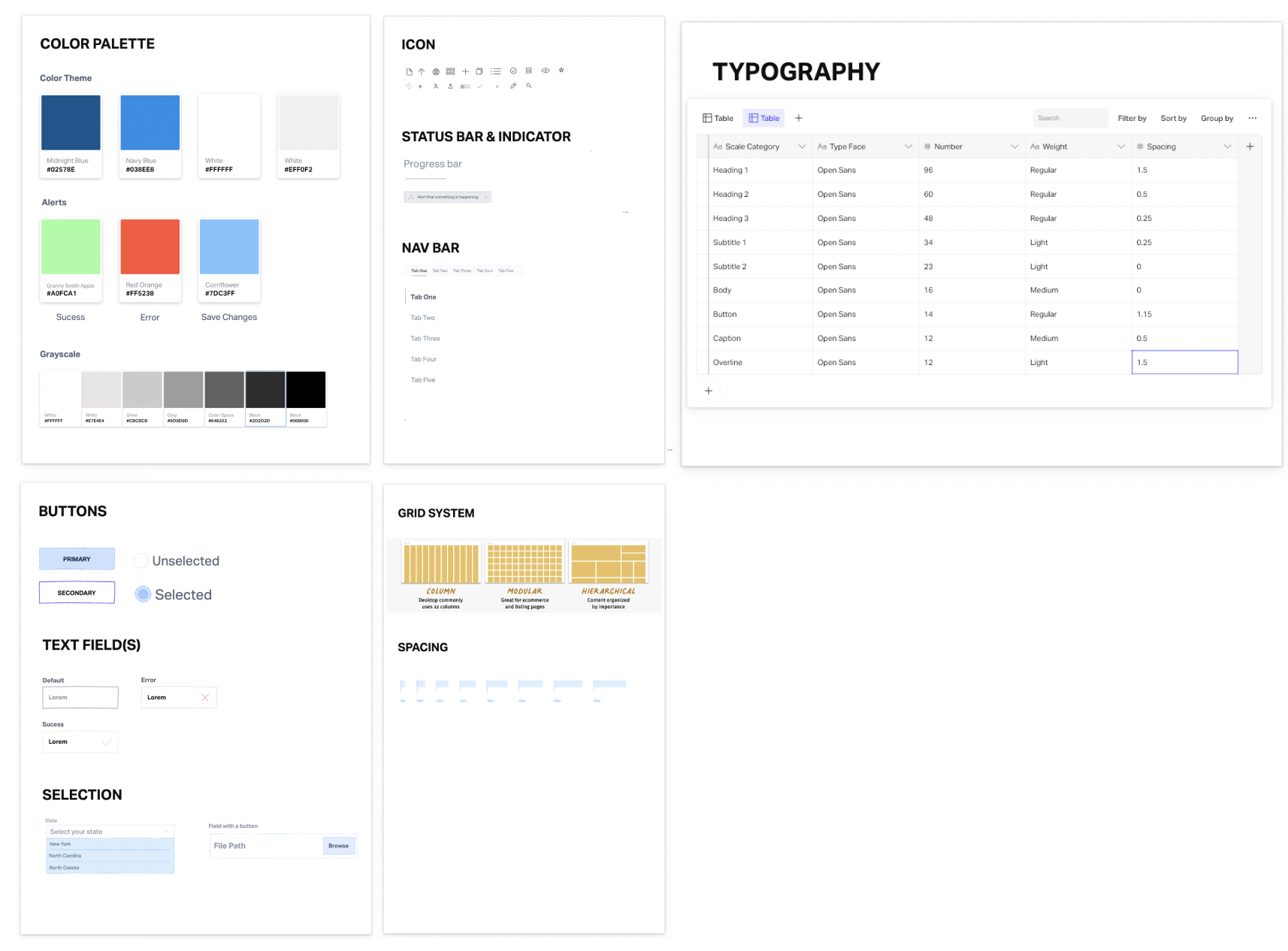
In response to user feedback, we established a design system aimed at efficiently handling design on a larger scope. This system not only fosters a unified language and visual coherence across diverse channels but also integrates fonts, colors, and icons aligned with our company's branding, thereby resonating with our users' familiarity.
Drawing insights from the input provided by the focus group sessions and collaborative meetings, we garnered valuable feedback that served as a foundation for refining our design approach. As a result of this iterative process, several noteworthy enhancements were made to the design, which are highlighted below:
A card dedicated to outlining the functionalities of Premium Setup, providing guidance for novice users on initiating their experience, accompanied by comprehensive step-by-step directions.
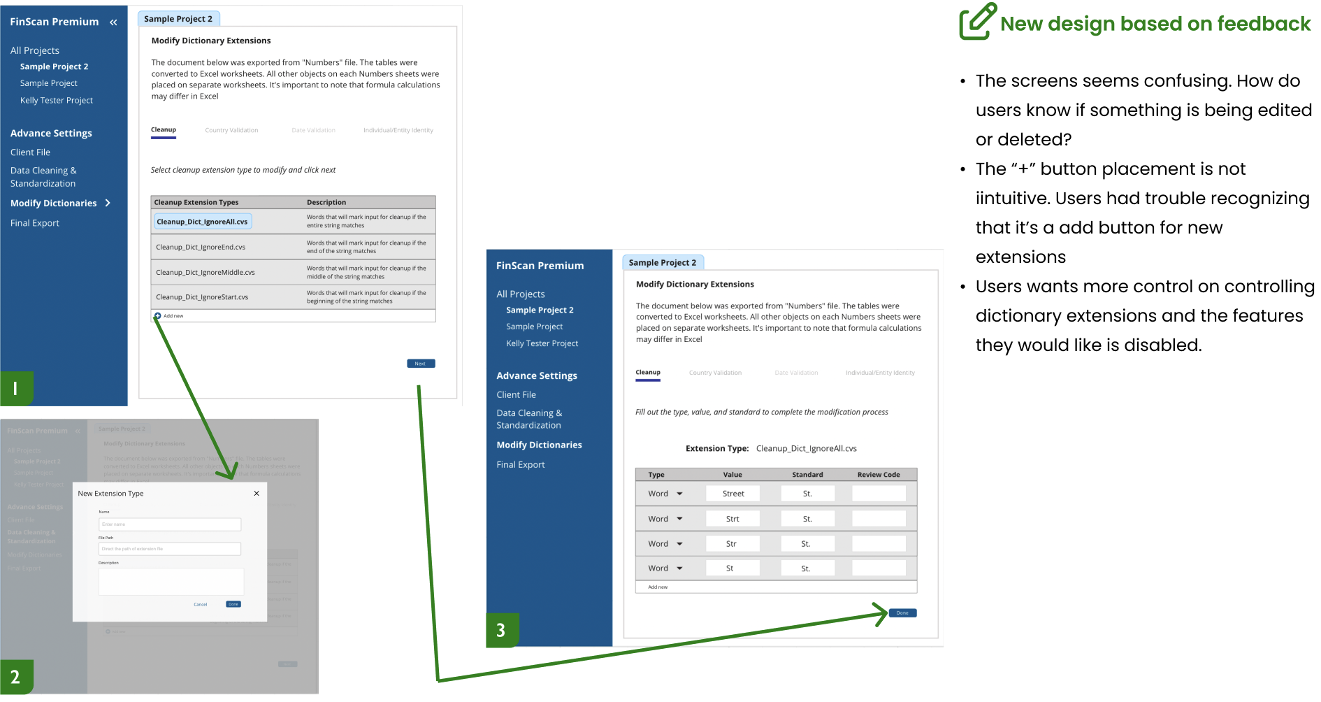
Redesign based on users' feedback.

A page dedicated to empowering users with the capability to edit, remove, and incorporate new dictionary extensions into their project/files.
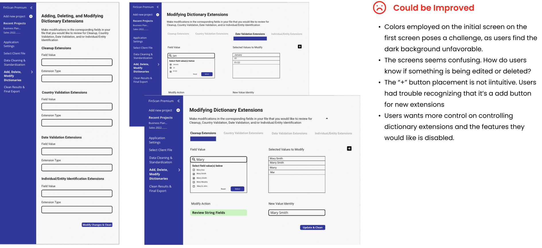
Redesign based on users' feedback.
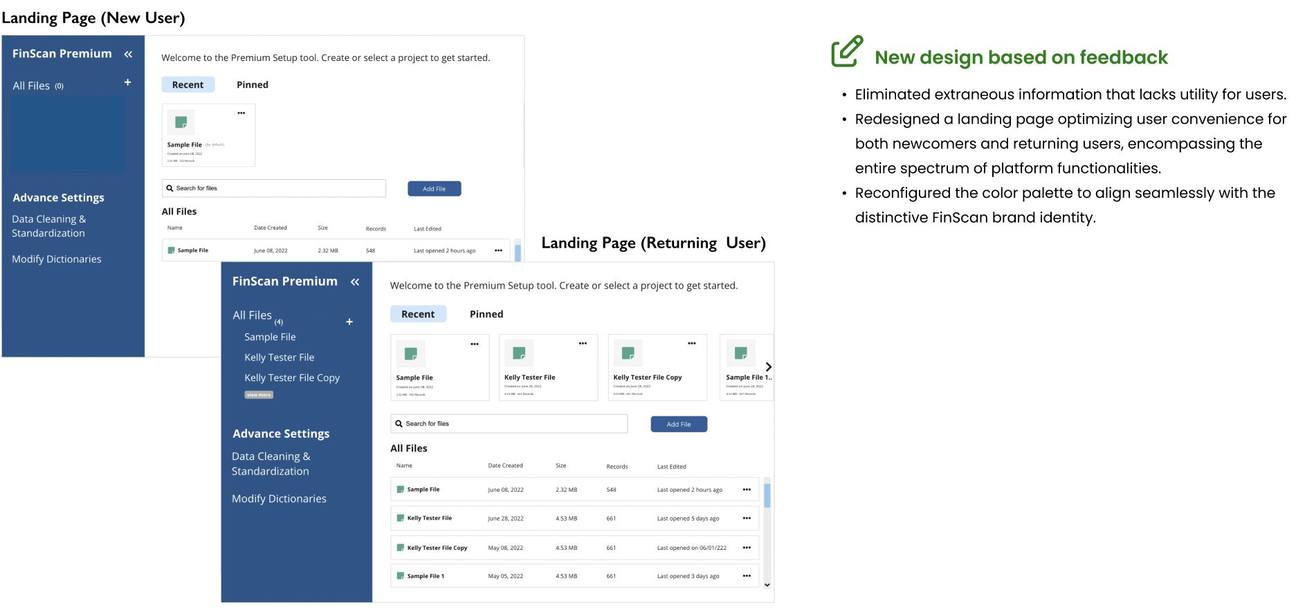
Following the usability testing phase, we made improvements to the design in response to user feedback. One notable change was the inclusion of FinScan's brand colors in the palette. Additionally, we introduced a "Recent" and "Pinned" section, providing users with convenient access to their files.
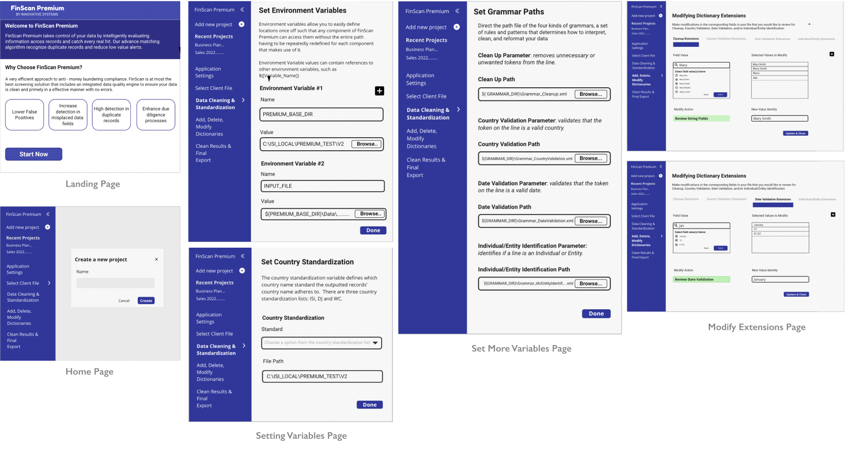
1. Landing Page
We designed a landing page with the intention of effectively communicating the essence of FinScan Premium to both newcomers and returning users.
This screen conveys a concise and informative message about the features we offer, while also providing users with the option to initiate a new project or access an existing one for further modifications. To enhance the platform's creativity and elucidate its primary functionalities, I incorporated illustrations as part of the design.
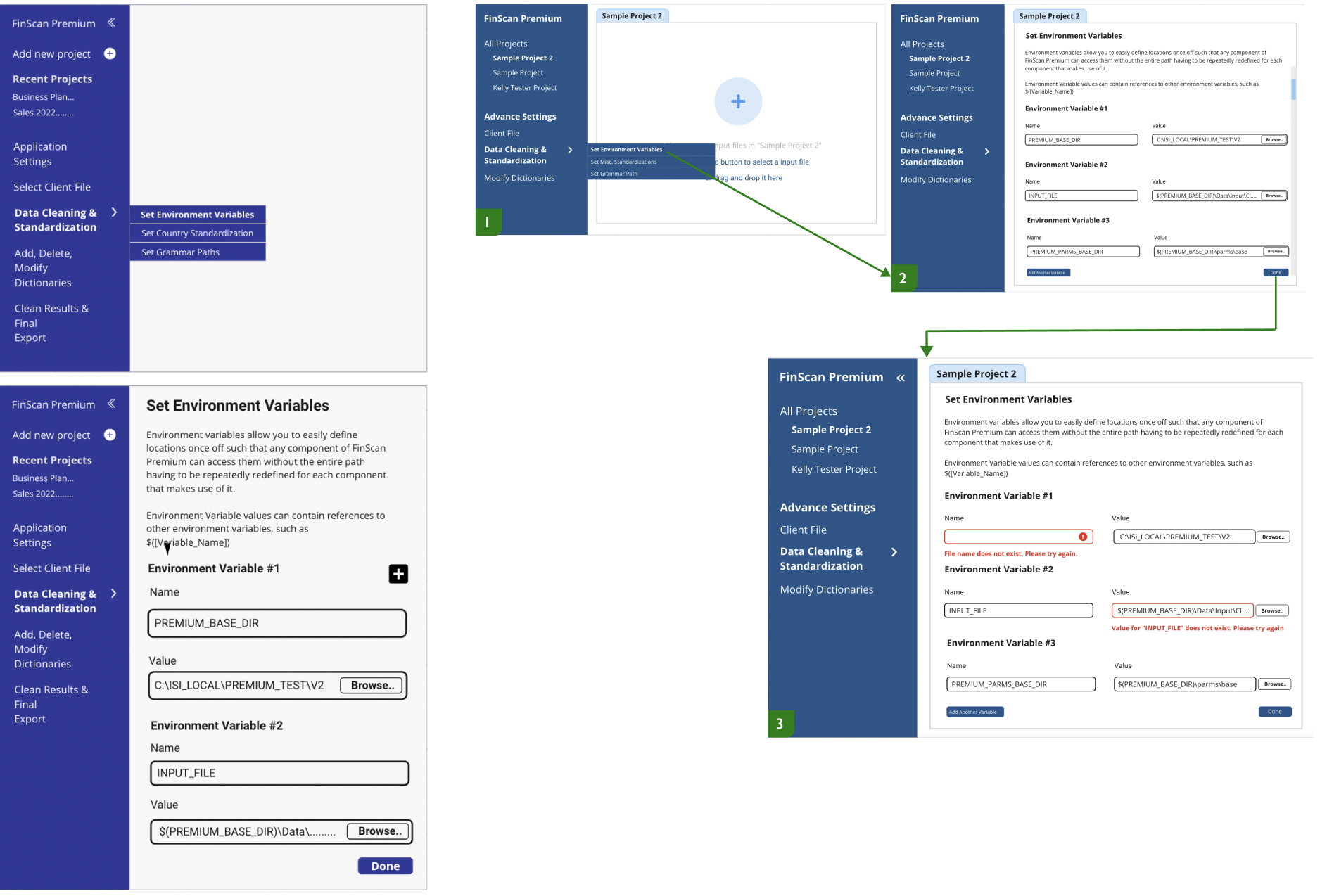
2. Data Cleaning & Standardization Page
We designed a page that allows users to set up their variables in the appropriate xml files.
This screen conveys a concise and informative message about what these variables are, how to navigate to each one through the tabs on the top of the screen, and shows feedback messages when users are running into errors to make the process more smoother for users.
3. Modifying Dictionaries Page
We designed a dictionary modification page to allow users to make edits to new and existing files.
This screen allow users to add dictionary extensions, delete, or add new extensions. By allowing users to navigate the four different types of grammar paths we have, users can conveniently make edits through several extensions at a time using the tabs.
During our usability testing, which involved a focus group, we identified a challenge: ISI Clients struggled to grasp our ideas, such as "landing page." This experience taught me the importance of empathy in my approach. I've learned to simplify my design explanations, avoiding excessive technical jargon, as if I were explaining them to someone completely unfamiliar with the subject matter.
We had the opportunity of engaging with our users face-to-face. Their feedback proved to be highly insightful, though at times, it was candid to the point of being uncomfortable. I distinctly remember one user saying, "I don't like the design; it feels disconnected to me". Initially, it stung, but I decided to delve deeper, asking the user to elaborate on what aspects of the design made them feel disconnected and which elements they found displeasing. To my surprise, the conversation was not as intimidating as I had anticipated, and it turned out to be immensely beneficial in guiding us towards refining the final design.